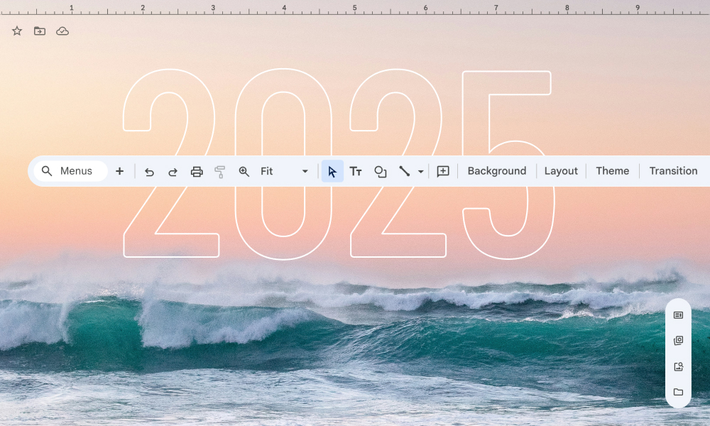
As we close out the year, we can officially declare that 2025 was The Year of the Deck. In the first half of the year, climate companies were figuring out how to respond to massive shifts in policy and funding. The investment or pitch deck became the primary tool to raise more funding and land key partnerships.
We met our clients where they were at. There’s a reason why decks are a good tool. While websites stay more static, decks often reflect new policies or goals first.
Decks are a great way to flex with change, but strong brands are built outside of the deck. They rest on longer-term values, goals, and pillars that should stay true for years rather than months. When companies get into purely reactive mode and rely on a constantly changing deck, we notice there’s often a lack of foundation and clarity that the market reflects. But decks serve a purpose. And this year they were critical.
So, what makes a strong deck? We asked our expert writers, designers, and strategists.
What makes a strong deck?
Carly, Senior Content Strategist + Copywriter: A compelling story. Start with something unique: ask a question, tell a personal story, paint a picture with all five senses. The rest of the deck should have a clear story that makes an argument and appeals to your audience’s intelligence. But, don’t forget to make people feel, too.
Macoe, Associate Creative Director: A strong deck generates interest and builds trust by giving enough information to engage the viewer without overwhelming them. Breathing room and clear hierarchy help set the stage for the story and brand to shine.
Jen, Founder + Creative Director: A strong deck tells a simple and compelling story with clear context and flow. Then, the deck backs up each point in your story with charts, data, images and proof. Your audience should be able to digest the deck quickly even if they didn’t read the charts.
Beibei, Senior Designer: A strong deck has a nice rhythm to its story. It doesn’t just pile on information. One thing leads to another. Like a good song, a good deck will have an intro, verse, chorus (hook), and an ending, to keep the viewer engaged in the story you are telling.
What’s the best process for creating a deck? Any tips from your sphere of expertise?
Jen: If you’re starting at square one: outline it first. Know your audience and the high-level story you want to tell that audience…and use one page for each part of the story at first. Write all the headlines. Then work to fill in with content that supports the story—whether it’s data you have, logos showing support, impact stats, or visuals that send a message. If you don’t have ideas for content, consult with a designer before just pulling images from the internet. There’s always a better way.
Macoe: Consider the message first and allow visuals to enhance that message and draw attention to it, without overshadowing it. A deck that will be presented in person can leave a lot to the speaker to say. If it’s more of a brochure-type deck that will be sent, skillful typographic hierarchy becomes even more essential.
Beibei: As a designer, I will speak more to the “look” of a deck. When the structure is built and the story has been written out, it’s time to design the deck. The first thing to consider is to align everything with your brand visuals. Use the visual brand language such as colors, typography, graphic elements, images, and styles to ensure a consistent voice across the different places you are showing up. This method builds out a strong base for all your communication pieces. It allows you to continue to iterate and hone your brand’s look and saves mental energy on recreating new assets each time.
What are key issues you see with decks?
Carly: Trying to cram too much on every slide. Your deck is not a filing cabinet. In order to tell a good story, you have to pick a few of the most compelling points and focus on those. Keep it copy-light and use charts and graphs that are easy to understand at-a-glance.
Macoe: Ditto to what Carly said! And also, no clear throughline between sections and slides. If it starts to feel like a book rather than an article, you’ll lose the viewer’s attention. Too many stock photos that either add nothing to the story or just duplicate what’s already being said with the words.
Jen: Forgetting that the audience needs context, and that they don’t know as much as you do about this topic. Spell it out simply and don’t crowd the deck with data if no one understands the data. Be direct in language supporting charts and analysis.
Beibei: Piggybacking on Macoe’s take, when decks aren’t engaging, it’s a big issue. If a deck just lays out facts, it won’t be interesting for people to engage with and remember. Showing real peoples’ stories related to your products or services, visualizing interesting/impressive data points, or demonstrating how your product/service could be impactful in a relatable way etc. are some good ways to bring people in. Also, the hierarchy of information on each page is really crucial. I’ve seen lots of decks filling all the corners of a page with information that are similar sizes, fonts and styles. This is chaotic and hard to navigate our eyes around. Clear hierarchy and limited main points on one page could all improve that.
Need a team that gets you and helps you update your decks and website as you grow? Check out Four Fin’s Fractional Creative Department.