Eco to powerful
Resurety came to us with a clear goal: evolve their visual identity to match the impressiveness of their data and their company’s growth. Their brand was stuck in the eco-branding aesthetic of the past, centered around wind turbines—a limiting and misleading representation of what they actually do. With enterprise partnerships and an eventual exit on the horizon, their early brand wasn’t doing the heavy lifting it needed to. We were excited to take on the challenge, energized by their incredible team and the potential impact of getting their brand in front of the right partners.
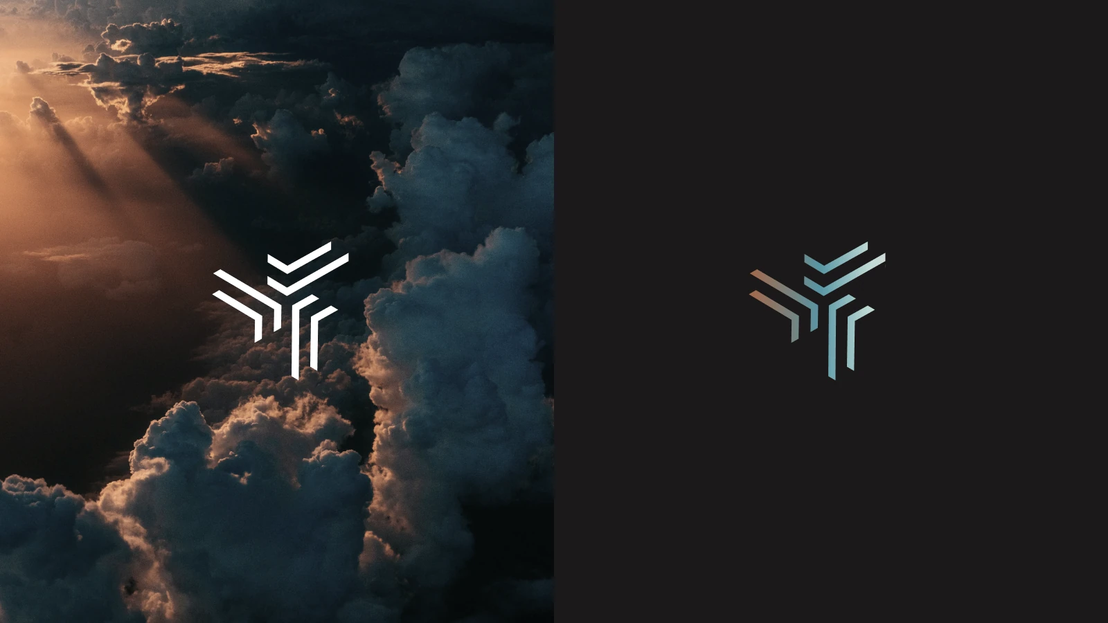
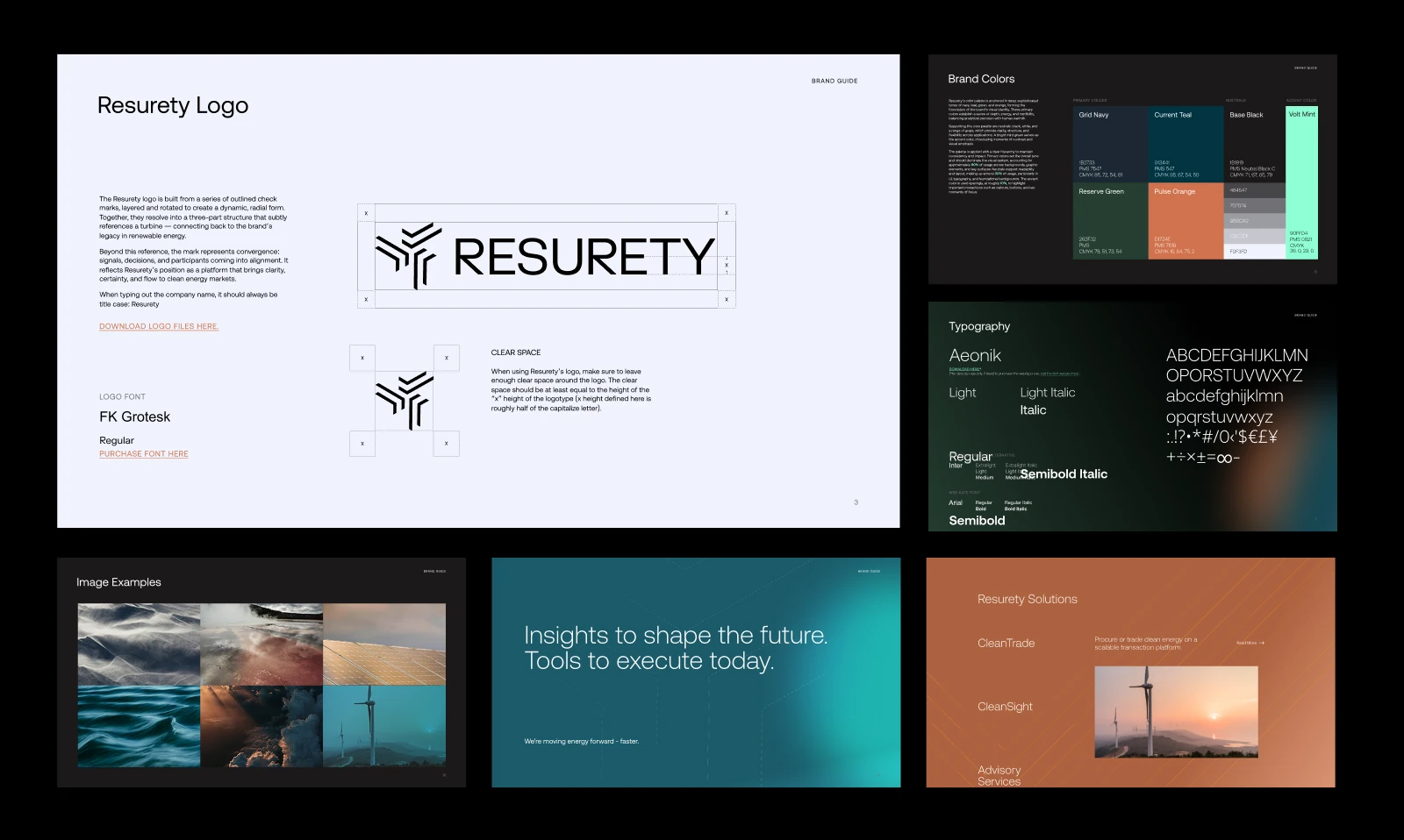
Our signature design process doesn’t start with black-and-white logos in isolation; we bring clients through a collaborative exploration of overall aesthetic first. Lead designer Beibei zeroed in on something essential in the name itself: the idea of sureness. Resurety’s platform is built on real inputs collected over a long period of time, which means their recommendations and insights carry genuine confidence. That insight became the foundation of the new logo—which is built from a series of outlined check marks, layered and rotated into a dynamic, radial form that resolves into a three-part structure subtly referencing a turbine which connects back to the brand’s legacy in renewable energy. The mark captures the robust multi-input data platform and represents convergence: signals, decisions, and participants coming into alignment.
We also recommended a small but meaningful shift: from RE to Re, stepping away from a “Renewable Energy”-forward read and into a modernized, confident brand name.
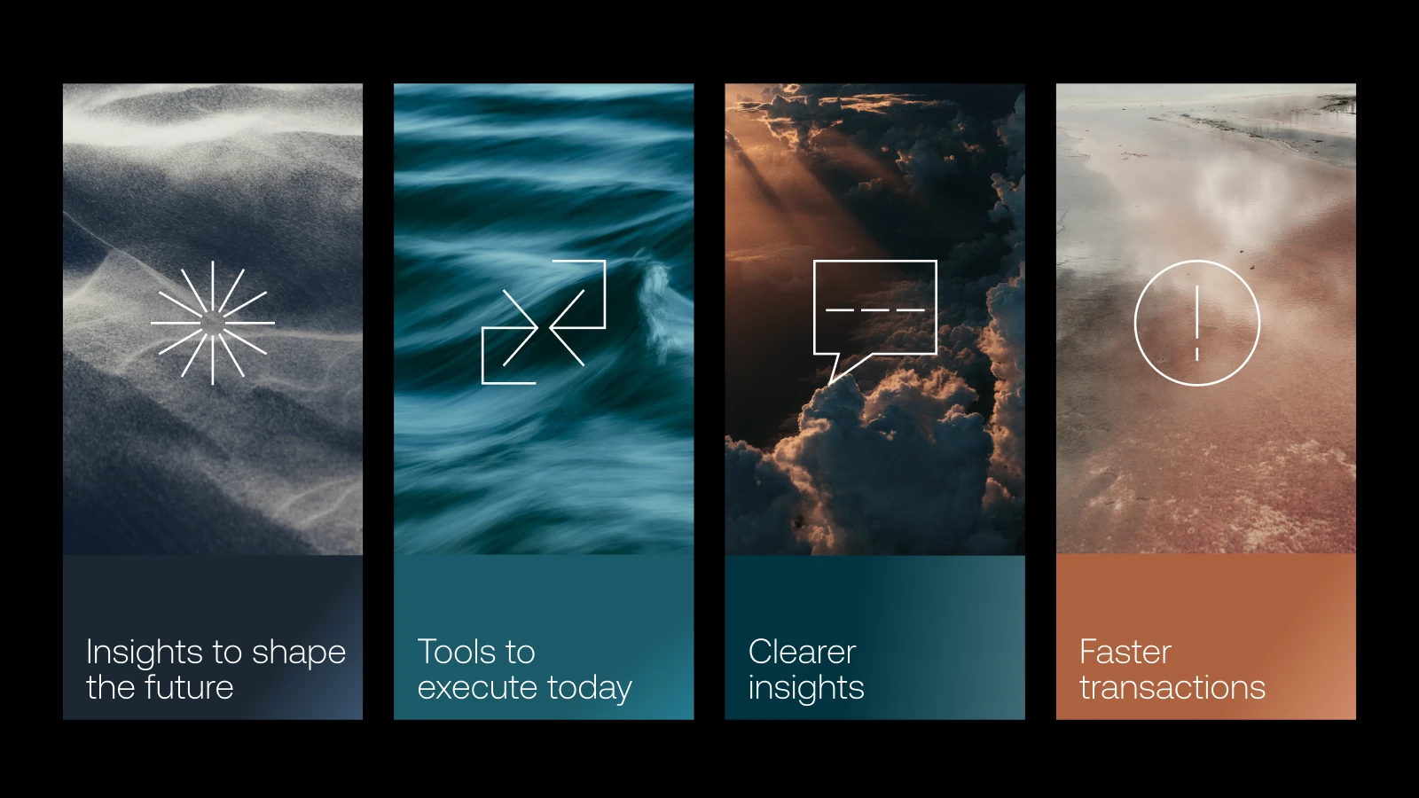
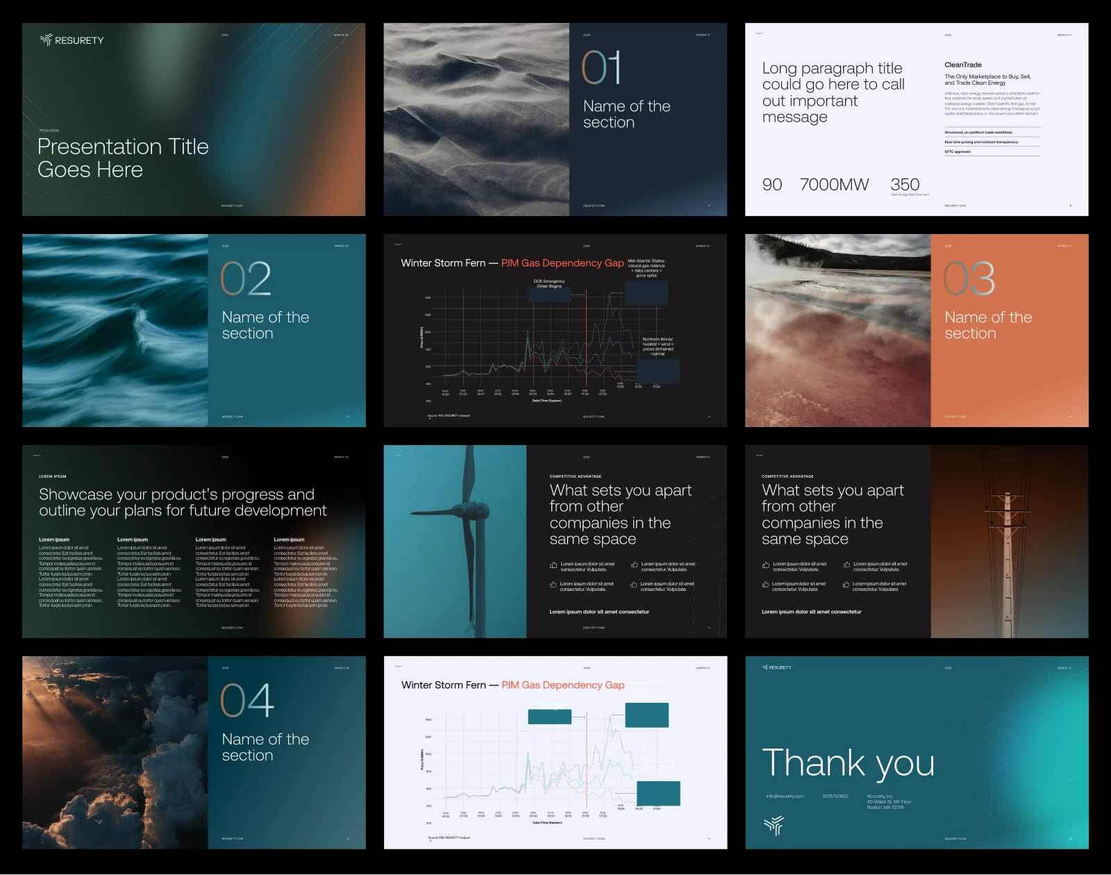
The design concept draws on the energy and power of the natural world, using macro photography of nature to anchor the visual language and a color palette that balances the depth of the natural world with Resurety’s precision. We walked a careful line—a company that harnesses the power of nature, but is also a sophisticated data platform. Those two ideas had to coexist without contradiction.
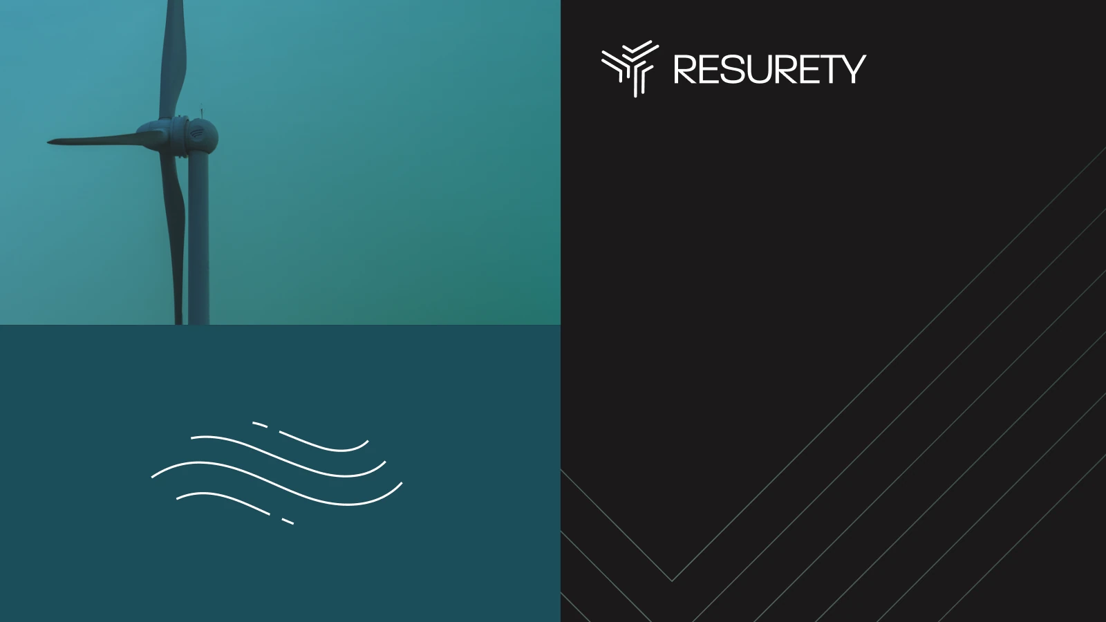
From iconography to deck layouts, Beibei took this brand from eco to powerful in a sprint-like process with multiple stakeholders and a strong emphasis on collaboration. The result is a brand system that finally matches the ambition of what Resurety is building.
We use cookies to keep things flowing smoothly. Cool?
Wordsmith, strategist, and overall language ninja.
In order to make big waves (and have fun riding them!), helps craft a solid, substantive, (super bad) soul of a brand.