I have a website footer fetish and I’m not afraid to tell the world about it.
There. I said it. Website footers are just as important (if not more important) as the rest of a brand’s website. They are essentially the go-to map of pertinent information visitors should be able to access quickly, but also an opportunity to provide a final branded experience.
I’ve rounded up several of my favorite footers currently out in the wild to share why they matter. Don’t worry, this is all totally SFW and hopefully provides inspiration for those thinking through their site’s user experience.
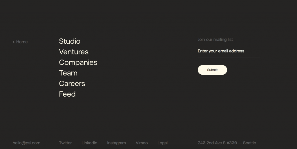
Tall, dark and handsome, this footer for Pioneer Square Labs takes up space unapologetically. I love the large type for important links because who says footers have to have tiny type?
Think inside the box.
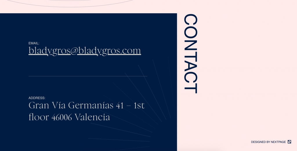
Blady Gros Holdings’ footer is minimal as far as information, but delivers maximum impact with design. This is a good reminder that a footer doesn’t always have to be full-width.
Simply delightful.
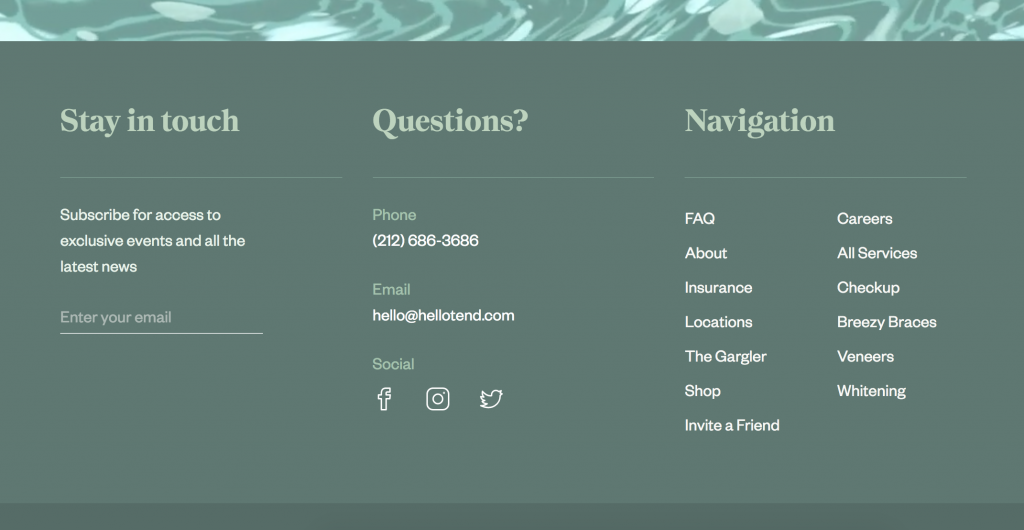
Tend‘s footer is a solid example for simplicity. It’s nicely organized with good typography, but also captivates with a mesmerizing animated bar just above.
Be my friend?
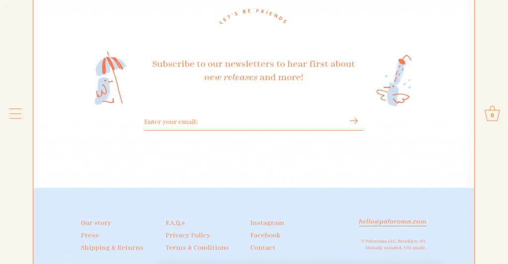
Cute illustrations and a small, but friendly invitation to be friends won me over on Palorama’s footer. What other ways can you engage your audience during this tail end experience?
Finally, VOTD’s fun icon and message provides one last moment of delight for visitors. If the contact and navigation information can live somewhere else, jump on one more opportunity to send a message about your brand.
I know I’m not the only one who loves a happy ending to my scrolling. If your website could use some love and attention when it comes to what’s on the bottom, reach out!
