There are a lot of ways to define “brand” and, even, to build them. Hopefully this post will help you understand what we mean when we talk about your “visual identity.” We’ll break down why it’s an important element of your brand, and why it’s so important to think big picture about design.
So, what do we mean by “visual identity”? Is that the same as a “brand” or “logo”? Isn’t “branding” what we focus on at Four Fin? The visual identity is only one part of how we define and approach branding. Let’s start there first.
Branding
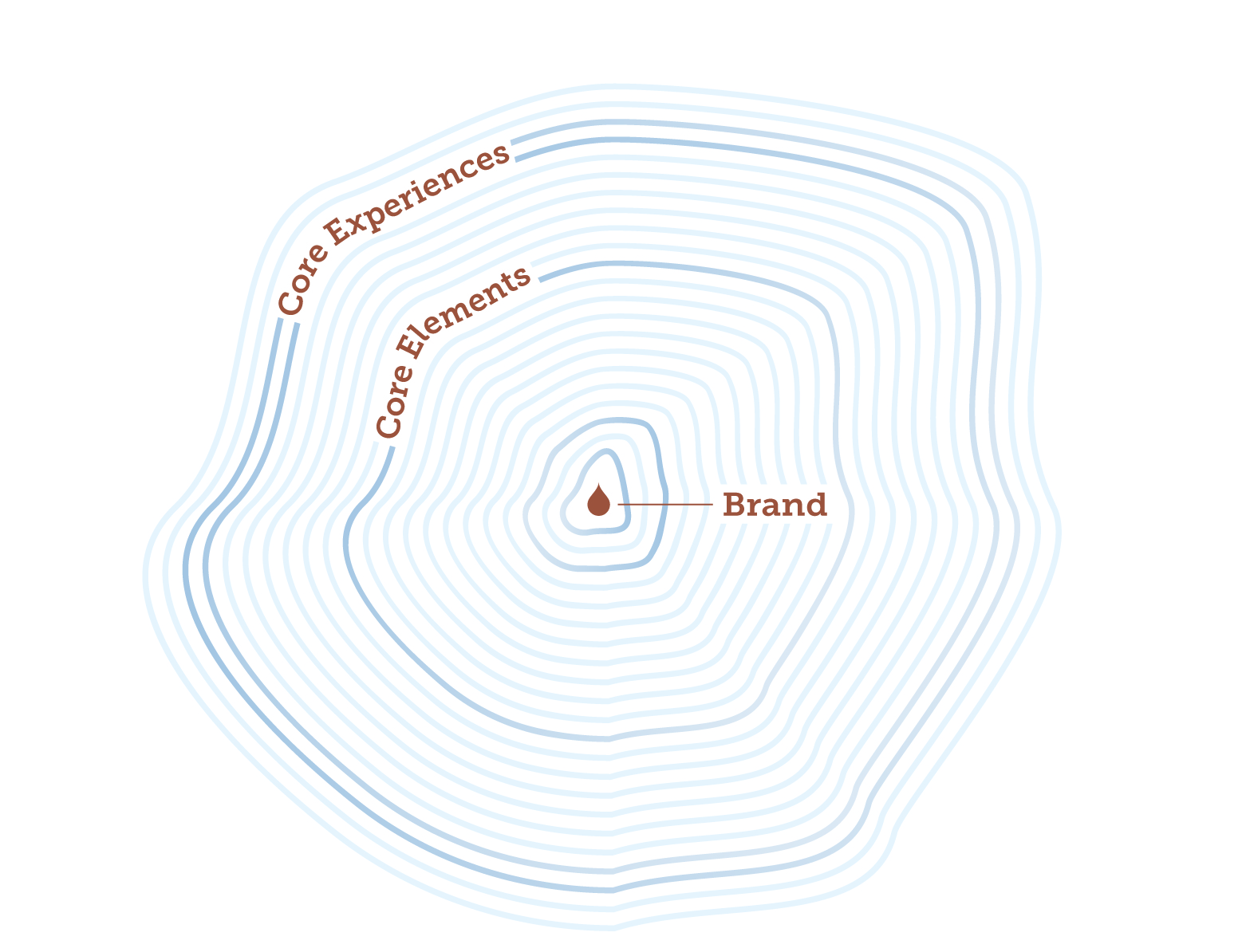
We believe a brand should inform everything, beginning with the brand strategy and rippling out through core elements and experiences.

So, in that sense, the brand is the heart of the company– full of passion, driven by emotion, tested by values, and relentlessly in search of authentic connections. Any action your company takes, policy it initiates, conversation it has with consumers – should all come from the core brand, working in unison to move the brand from something unseen below the rib-cage, to something worn proudly on your company’s sleeve.
Once you understand that the brand is the core that informs everything, you also understand how the visual identity cannot be created without uncovering it. The ‘visual identity’ is simply the visual representation and communication of the brand to the world.
“Oh, so by visual identity you mean the logo right?” Yes, and…
Logo

The logo is one part of a cohesive visual identity, and we’d argue, not the most important part.
Take your favorite brand. Go to their website, and cover the logo with your hand. Is it still the visual identity you know and love? Does it still give you the feelings of the brand it should? Now, go find a company you’ve never heard of, and look ONLY at their logo. You get very little from it. Partly because you don’t know them at all. That’s the point.
“Brand building” is the act of communicating, servicing, interacting, listening, and forming a relationship with your audience. So, the logo only serves to help you identify the brand you’ve already grown to know and love (or hate).
Visual Identity
A visual identity however, is where the magic happens and a keystone of your brand’s core elements (cue back to rad chart above). We thrive on developing them and really appreciate a job well done by the masters. (#redantler comes to mind).
Below is a list of assets and elements that can be curated and created to form the visual identity for a brand. When done right, they come together to form the perfect harmony – like longboards and summertime.
- Logo and Logo set (yes, more than one)
- Typography (Fonts)
- Color palettes
- Images
- Textures
- Illustrations
- Animations
- Patterns
- Simple shapes

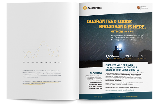
The AccessParks visual identity combines bold fonts, dark colors, and inspiring photography.
Once established, your visual identity allows for the brand’s core experiences (website, social post, ad, collateral, etc.) to take shape, consistently. We already know that when these experiences are well designed with a clear message, they have more potential to grab the attention of your audience. The kicker, is that when these experiences are also consistently designed with your brand’s unique visual identity tool set, they strengthen recognition of the brand.
Visual identity elements improve effectiveness of any visual communication, and act as brand identifiers, all at once.
So bad-ass, right?
Our point: nail down some guidelines for your brand’s visual identity (beyond selecting fonts and colors) so that your visual communications also become brand identifiers as much, if not more, than the logo is.

tl;dr
Your brand is the heart of your company. It’s formed by building relationships through actions, decisions, initiatives and communications. Your visual identity is how you consistently design your communications. Creating your visual identity starts by defining the visual assets and rules to help you stay consistent: think fonts, colors, images, logos and sub-marks. Then following those rules over and over to create an identity that has recall and brand recognition.


