A VC that’s colliding on purpose
Venture Capitalists typically source deals at their speed, on their terms, and hoist founders into VC circles. For founders, the journey can feel random and fraught with pitching, uncertainty, and endless door-knocking.
Collide Capital believes that staying close to a founder’s community, and creating layers of connected resources are a crucial way to support and cultivate excellence. They also believe in arranging intentional ‘collisions’ for founders and funders, introductions and resources provided with purpose.
What They Got
Brand Session
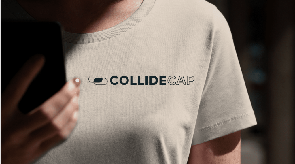
Logo
Brand Guidelines
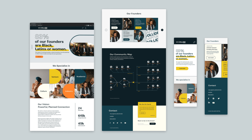
Website Guide
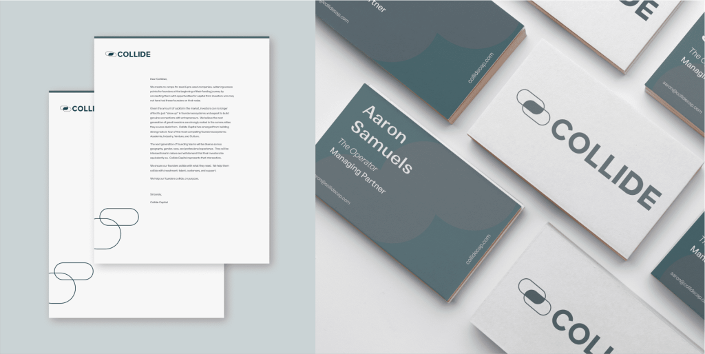
Business Card
Deck
Letterhead

Launch Ready
With an oversubscribed fund zero and a $66M launch fund, Brian Hollis and Aaron Samuels, the brains and hearts behind Collide Capital, came to us asking to polish their brand in a way that does justice to their incredible track-records and help vault their debut as one of the largest Black-owned funds to ever launch.

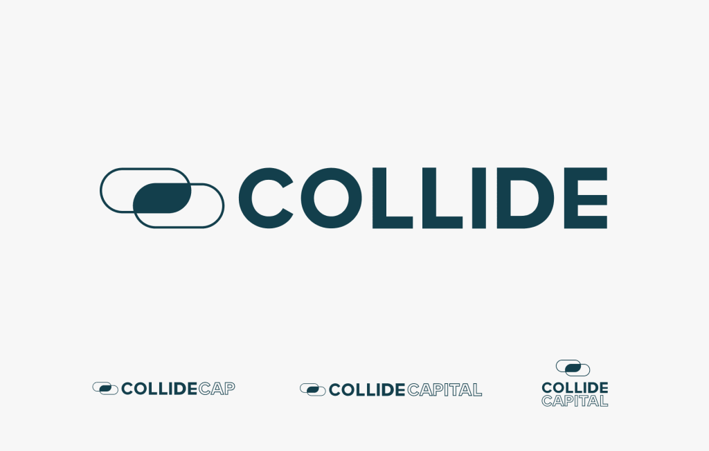


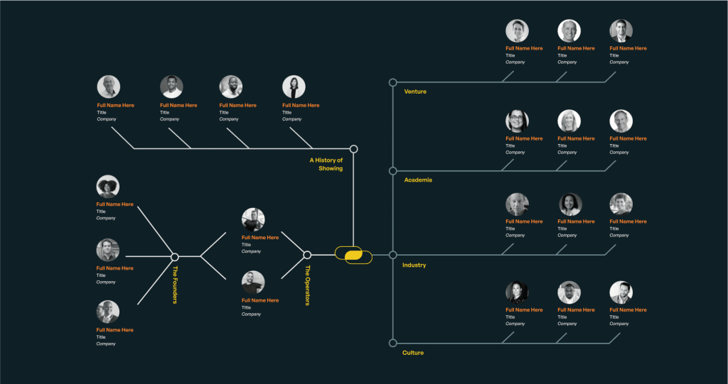
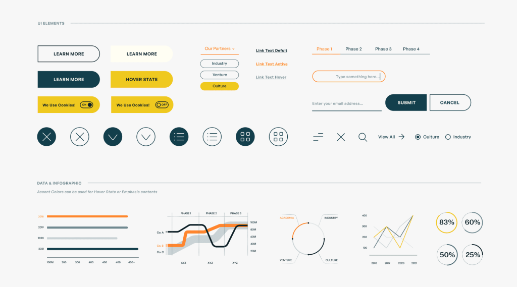
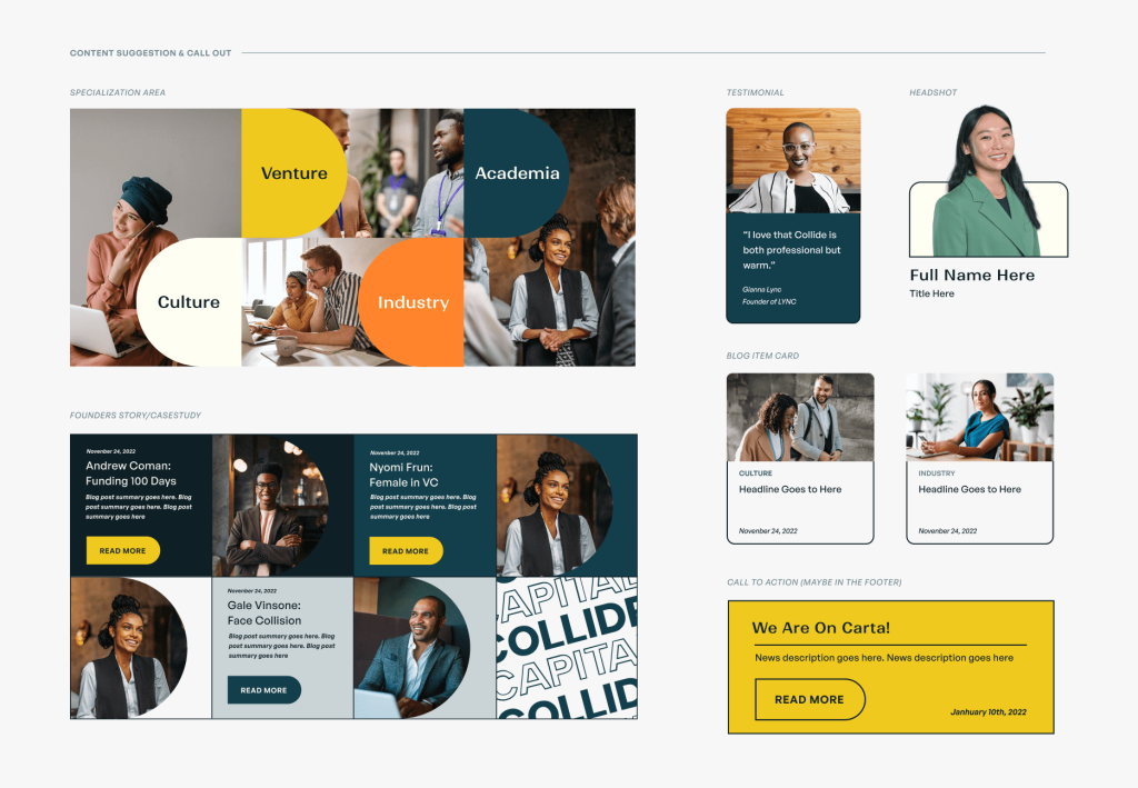
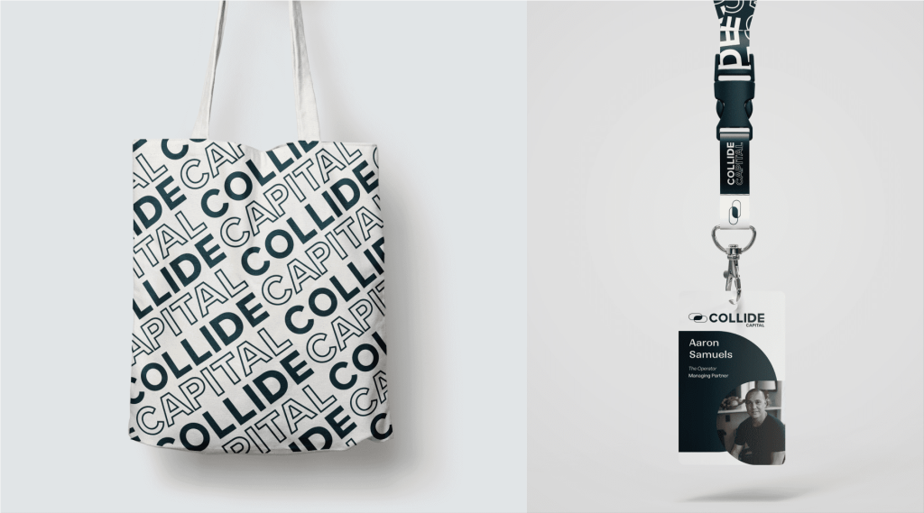
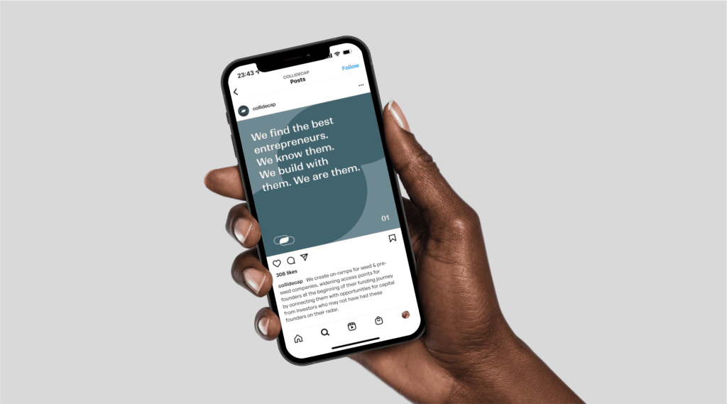
Through a Brand Session, the Fins helped re-envision the Collide logo and set the brand tone and direction. In partnership with PR bright lights at BAM, we built an intentionally connective brand that made a beautiful debut, even making its way to Times Square.
A Brand that’s Going Places

