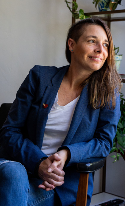
Category: Design

Design should be smart

Bringing your brand to life is an opportunity to utilize design as a tool to communicate more effectively instead of just trying to look good.  We love good eye candy when we see it, but not at the expense of losing the message or purpose.

Here are three pointers for sticking to smart design:

Addition by subtraction

Always ask, does that element need to be there? Don’t make your audience work to understand what’s being communicated. Keeping designs clean and focused is kind to your audience.

Catalogue design for Island Stone prioritizes Pinterest-worthy install photography along with color and sizing options.

Design is communication

The point of good design is to communicate! What is the copy really saying? What do you want the audience to feel when they read it? How can we use design to do that quickly? (see point above about keeping designs simple too).

Timely ads for Beach Haven articulate a clear message both visually and verbally.

Uniqueness through concept

What is the concept? How can you show it with visuals? Push past your first, second, and third idea because the first ideas that surface will be techniques you’ve seen before. Breaking out of what’s expected will make your work stand out.

PR firm BAM Communications lives by the idea that “stories move the world, we move stories forward.” By repurposing mockup kits used in the design industry, we created custom conceptual art that marries the lust of success with a sense of tangible results.

Finally, don’t forget to collaborate along the way. Share early and often, and don’t let your ego get in the way. You’ll find that clients are creative too, and want to be part of the process!

Know that design could work smarter for your brand, but don’t know where to begin? Reach out!

Another Virtual Brand Camp Success: Mangrove

No conference room? No problem. 

Many of our clients don’t call San Diego home, thus Zoom meetings and virtual Brand Camps have become second nature to our team. The key is clear communication on expectations, and to be fully present on calls as you would be in person. Slack off, game face, on. 

We felt right at home collaborating with the Mangrove team over the past two weeks, helping uplevel their brand as they continue to grow their remote team of talented web developers and designers along with a roster of conscious-forward clients.

Curious about their name? Mangrove trees are flexible plants that help other organisms thrive. Their incredible root systems span land and water to protect shorelines and nearby creatures. Our new visual identity nods to these facts, celebrating Mangrove’s mission to help good companies do great work while staying adaptable as an organization.  

We’ll share more details and the full identity once they roll out the new brand. In the meantime, Hio is another virtual Brand Camp success worth peeking at.

Destination: Bohavn

Shedding light on our recent brand design work for Bohavn, a micro housing development venture to be located at Powder Mountain in Eden, Utah. The location attracts some of the brightest and most artistic individuals around the world looking to enjoy connection and solace.

Destination branding is always a unique challenge because it requires capturing the essence of a location, often at a place we have yet to visit. 

Luckily, close collaboration with our client, asking the right questions, and some very talented creative chops on our end (it’s ok to pat ourselves on the back here and there) led to a new brand centered around intentionality, practicality, and curiosity. 

We developed a new name, Bohavn, that combines Bo (Swedish for ‘nest’) and Havn (Danish for ‘harbor’), alluding to the development’s Scandinavian design and intended feeling of comfort/coziness.   

The visual identity is a conceptual nod to the surrounding landscape of mountains, sky, and sun. Bohavn will incorporate sustainable design to ensure its footprint honors the environment, and the identity system reflects this. 

Rebranding Island Stone

After 20 years of building a solid reputation in tile and interior design circles, Island Stone was ready to up-level its brand for the next 20 years. 

Island Stone had become synonymous with pebble tile despite offering products spanning glass, timber, and other stone tile lines. In addition, the traditional showroom distribution model for the industry was increasingly evolving to more unique e-commerce models directly targeting consumers.

Due to these factors, Island Stone recognized the need to evolve its perception in the marketplace beyond pebble tile, especially if more consumers would be experiencing the brand. 

Often, the way to up-level and move forward is uncovering where we came from. Our brand strategy and visual identity evolution for Island Stone celebrates its founders’ spirit of adventure and reputation for quality materials. 

By amplifying the emotional traits of Island Stone (vs. functional pebble tile), we helped elevate the company to be a more valuable and experiential lifestyle-bound brand ready to attract both showroom and consumer audiences alike. 

Explore the full case study here.

Visual Identity: The company your logo keeps

There are a lot of ways to define “brand” and, even, to build them. Hopefully this post will help you understand what we mean when we talk about your “visual identity.” We’ll break down why it’s an important element of your brand, and why it’s so important to think big picture about design. 

So, what do we mean by “visual identity”? Is that the same as a “brand” or “logo”? Isn’t “branding” what we focus on at Four Fin? The visual identity is only one part of how we define and approach branding. Let’s start there first. 

Branding

We believe a brand should inform everything, beginning with the brand strategy and rippling out through core elements and experiences.

So, in that sense, the brand is the heart of the company– full of passion, driven by emotion, tested by values, and relentlessly in search of authentic connections. Any action your company takes, policy it initiates, conversation it has with consumers – should all come from the core brand, working in unison to move the brand from something unseen below the rib-cage, to something worn proudly on your company’s sleeve. 

Once you understand that the brand is the core that informs everything, you also understand how the visual identity cannot be created without uncovering it. The ‘visual identity’ is simply the visual representation and communication of the brand to the world.

“Oh, so by visual identity you mean the logo right?” Yes, and… 

Logo

The logo is one part of a cohesive visual identity, and we’d argue, not the most important part. 

Take your favorite brand. Go to their website, and cover the logo with your hand. Is it still the visual identity you know and love? Does it still give you the feelings of the brand it should?  Now, go find a company you’ve never heard of, and look ONLY at their logo. You get very little from it. Partly because you don’t know them at all. That’s the point. 

“Brand building” is the act of communicating, servicing, interacting, listening, and forming a relationship with your audience. So, the logo only serves to help you identify the brand you’ve already grown to know and love (or hate).

Visual Identity

A visual identity however, is where the magic happens and a keystone of your brand’s core elements (cue back to rad chart above). We thrive on developing them and really appreciate a job well done by the masters. (#redantler comes to mind). 

Below is a list of assets and elements that can be curated and created to form the visual identity for a brand. When done right, they come together to form the perfect harmony – like longboards and summertime. 

  • Logo and Logo set (yes, more than one)
  • Typography (Fonts)
  • Color palettes
  • Images
  • Textures
  • Illustrations
  • Animations
  • Patterns
  • Simple shapes

The AccessParks visual identity combines bold fonts, dark colors, and inspiring photography.

Once established, your visual identity allows for the brand’s core experiences  (website, social post, ad, collateral, etc.) to take shape, consistently. We already know that when these experiences are well designed with a clear message, they have more potential to grab the attention of your audience. The kicker, is that when these experiences are also consistently designed with your brand’s unique visual identity tool set, they strengthen recognition of the brand. 

Visual identity elements improve effectiveness of any visual communication, and act as brand identifiers, all at once.

So bad-ass, right?

Our point: nail down some guidelines for your brand’s visual identity (beyond selecting fonts and colors) so that your visual communications also become brand identifiers as much, if not more, than the logo is.

tl;dr

Your brand is the heart of your company. It’s formed by building relationships through actions, decisions, initiatives and communications. Your visual identity is how you consistently design your communications. Creating your visual identity starts by defining the visual assets and rules to help you stay consistent: think fonts, colors, images, logos and sub-marks. Then following those rules over and over to create an identity that has recall and brand recognition.

FINterview Series: Macoe Swett

Meet Macoe Swett, Four Fin’s Senior Designer and resident DJ. We asked the Fin who knows a little bit about everything (really) to answer three questions about herself.

What is the most uncomfortable thing you have done?

Teaching my first design class was the most uncomfortable thing I ever did. I remember it was an 8am class on a Monday morning and although I was excited about it beforehand, when it came time to do it, I was doubting myself. I thought “I could just be sitting at my computer designing, and instead I have to go speak in front of a class of 25 strangers. Why did I agree to do this?” But within the first 30 minutes or so, my fear dissipated, the students were kind and genuinely interested in what I had to share. By the time I taught my second class that evening, I was much more confident. Teaching has taught me so much about speaking to groups, whether strangers, clients, or internal teams, and I’m grateful for that experience!

What is your favorite food?

I’ll eat just about anything vegan, but I do have a special place in my heart (stomach?) for Italian food. Nothing beats a good lasagna! Fortunately, there are so many good non-dairy cheeses nowadays and it’s not too difficult to make a delicious plant-based one. Growing up, my friend’s Italian mom taught me a trick: add sugar, a little cinnamon, and two egg whites to the ricotta. Now I use a plant-based ricotta (or just crumble some tofu) and of course I skip the eggs (or use Ener-G egg replacer), but I do still love the sugar and cinnamon trick! 

 You’re a new Pantone color, what are you called? 

Hmmm… the hair color I’ve been using lately is called Electric Paradise, and it’s the perfect meeting of hot pink and orange, but on me it fades quickly to a blorange tone (which I’m surprisingly ok with). With that in mind, I would name myself “Bellini Blush” (the original Bellini cocktail was named after the painter Giovanni Bellini, known for his warm yet subdued color palette).

Who’s your dream client? 

I would love to work with Arctic Fox! Not only is their hair color my favorite, it’s vegan, cruelty-free, and 15% of their profits are donated to prevent animal cruelty. They also have informative blog posts, including hairoscopes! Plus their IG is so colorful, it makes me smile.

Find more Macoe via LinkedIn or Instagram (and see that Bellini Blush in action)

Brace Yourselves, the Fins Have Rebranded

You may have noticed if you’re a Fin fan, that recently, we have been slowly rolling out our new brand across our marketing channels.

A branding firm doing a rebrand? So meta.

I get it, but this is big to us. It signifies a new era for Four Fin that’s hard to put into words, but I will sure try.

Started as a designer, now we here

8 years ago, when I started Jen Derks Design, there was a lot I didn’t know about growing a company, let alone a branding firm with four badass employees and an inspiring nationwide client roster. But that was okay. I was a good designer, wanting to do good work for good people, and raise some good kids with my good husband. Check. Check. And check mate.

Fast forward to today. Four Fin is a team of five with a list of well vetted partners, dialed-in business systems and tools, and a successful 2-week branding service called Brand Camp. We have a transparent office culture we’re proud of, health benefits, retirement, clients who are crushing it, an official @pandr office mural, and most important of all, a beer and La Croix fridge. I mean, we’ve officially ‘arrived’ with that last one.

We’ve also seen the impact of our work: Solopreneurs gaining confidence and momentum in their early days; small companies of 2-5 growing to exceed multi-million dollar revenues; and most recently, a start-up client announcing a $125 million dollar exit.

Shoes too small

Because of all of this growth, over the last year or so, we started to feel our Four Fin brand no longer represented us. 

We didn’t want to send visitors to our website anymore because “it didn’t feel like us.” We couldn’t quickly explain who we were and how we were different. We realized just how our clients feel when they come to us for help (talk about great UX research). It was clear, we were holding ourselves back by not doing what we do for others, investing in the brand.

Evolution, not revolution

So, who was Four Fin? Cue the strategy/therapy sessions. We realized that what matters most to us has always been there but we just had never put it into clear words. It isn’t learning new marketing tricks, competing for likes, or designing things that look cool for cool’s sake. The reason we love what we do lies in this purpose:
Connecting genuinely with others to help them see differently and live out the best, most contagious version of their story.
This is what we do every day at Four Fin with our clients, and with each other. We also know that we want to do this in our own way—as partners, above the weeds, fast and fun, thoughtful and honest.

The new Four Fin

With this clarity, and other strategy pillars defined, we were able to craft a new brand that speaks more true to who we are and how we work. The personality on our website matches the personality you’ll meet on that first phone call, or tenth meeting, because the whole team is clear on what it means to be a Fin. Our brand personality is defined as:

Direct   Confident   Informed  meets  Casual   Upbeat   Collaborative

A slab-serif typeface and deeper hue of Four Fin blue give the brand a casual,  confident and direct tone: Clear is kind. BS has no place here.

The logo for the name Four Fin was carefully crafted to make sure the letterforms were arranged in a fun, upbeat way, as if they were enjoying their successful collaboration.

A secondary mark was created for a more casual representation of the brand that nods to our surf-inspired name. We all thought turning a ‘Four’ into a surfboard for the ‘fin’ to catch a ride on was very clever. Killed it Kendall!

Alongside new marks, fonts, colors, images and visual language was a new upbeat and informed tone of voicelike a trusted friend who drops truth bombs in your best interest and has no problem poking fun at themselves. You’ll see it in our copy, and on the phone with us when you call to say hi. We think you’ll enjoy getting to know us.

Onward

Take a look around our new website and get to know the new Four Fin. An updated newsletter will hit in a couple of weeks so sign up to see it, and our social channels are always poppin’ with good conversations—don’t be shy out there!

Meanwhile, we’ll be over here—enjoying every branding project, every human interaction, and every gift this work provides as we head into the next 8 years of branding companies with passion.

Thanks for riding along with us to learn about this moment in Four Fin’s evolution. We wouldn’t be here without you.